How to Make Business Cards: 4 Small Tips That Make A Big Impact

Millions of business cards are printed and exchanged every year, and many regard that little 2 x 3.5-inch piece of cardstock as a business owner or entrepreneur's first chance to make a positive impression. Many people don't yet have the budget to invest in graphic design services, or they are simply do-it-yourself types who prefer to design their own business cards.
Regardless, creating your business card is a great opportunity to think about your branding while exercising your own graphic design skills. If you'd like to know how to make business cards that will grab attention and hopefully lead to more clients and sales, here are a few small graphic design tips that will help make a big impact.
1) Consider the Size, Shape or Material
When thinking about the size of a business card, you'll want consider whether you want a standard size, or a more unique one. Rectangular business cards are more common and tend to be less expensive than custom-size cards. If you're looking for convenience, choose a standard business card size. It will be easier to carry around and slip into a pocket or wallet.
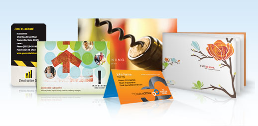
If you want a more unique size, die cut business cards or magnetic business cards might be a good option. Rounded edge business cards are great for creative professionals who want an alternative to sharp-cornered cards. Another idea is a leaf business card, which has rounded corners on opposing ends (like the upper left- and lower right-hand corner). You can also try a folded business card in the event you need more real estate to get your point across. When thinking of how to make business cards that will help you stand out from the crowd, these custom sizes and materials (though a bit pricier) are a great way to do it.
2) Think About the Type of Coating
Another thing to consider for your business card design is the type of coating: do you want a high UV gloss, or matte coating? Some people feel a glossy coating is more elegant and professional; others feel a matte coating is more creative and unique. The advantage of a matte business card is that the surface is soft and silky, and it can easily be written on with a ballpoint pen. It's more difficult to write on a glossy business card, but you still may want to use this type of finish if you want to bring out the bright colors of your design.
3) Use Fonts That Represent Your Industry or Business
Typefaces, or fonts, are a simple way to add personality or describe your business, services or products. Just don't use too many at once. Remember, your main goal is to share your information, and you can't do that if you have too many design elements clashing with one another. Consider type that speaks to the kind of work you do: if you're in the financial industry, use a serif font (such as Times New Roman) rather than a more playful one that might make you seem unprofessional. If you want to communicate that you're a modern business, Century Gothic or another clean sans serif font is ideal. Avoid novelty or overly-ornate fonts unless you want a dramatic design. Above all, make sure the font styles you choose are legible when printed on a small format such as a business card. Printing out a test version from your computer might be a good idea to ensure your contact information can be read easily. Learn 6 typography design tips.
4) Use the Color Spectrum Effectively
Colors invoke many different feelings. Think about the last time you walked down the laundry detergent or frozen foods aisle. Chances are you may have felt one frozen dinner was healthier than the rest because of its green package, or that one particular stain remover was most effective. This works the same way for business cards: a colorful business card might evoke certain emotions that you want to associate with your business. Certain colors can also be used to target different demographics.
For example, many massage therapists tend to have purple business cards to communicate a sense of calm, and political candidates often have white or blue business cards to give an impression of loyalty and trust. Freelance graphic designers, photographers, or others in the creative industry might choose bright colors such as yellow or orange which evoke warmth, creativity and imagination. The obvious choice for a financial adviser might be a green business card, but depending on his or her niche, a black business card might give a sense of elegance and sophistication. Read more on benefits of CMYK offset printing.
Just as with fonts, the key is to use color sparingly. Try using a solid background color that complements your font color, and avoid using more than three different colors total. Last, but not least, be sure you're using the right color mode when you're designing your business cards. Most online printing companies require CMYK (instead of RGB), so be sure to convert your files to the correct mode using graphic design software. That way, you can be certain your colors are printed exactly the way you want them.


