33 Checkpoints: quality printing at the speed you need.

All Products
Marketing Materials
Business Essentials
Appointment Cards
Business Cards
Carbonless Forms
Direct Mail
EDDM
Envelopes
Key Card Holders
Letterhead
Loyalty Cards
Mailing Services
Plastic Business Cards
Round Business Cards
Presentation Folders
Self-Seal Envelopes
Silk Presentation Folders
Square Business Cards
Standard Business Cards
#9 Envelopes
#10 Envelopes
Boxes & Packages
Labels & Stickers
Banners, Posters & Signs
Promotional Items
All Products
 It would be really easy to write yet another blog post about Comic Sans and Papyrus. How, as designers, we feel like “throwing- up in our mouths” whenever we see someone use Jokerman or Curlz MT in a shop window or on a


Ha! I love this post! You couldn’t be more right about Bleeding Cowboys! That font is a design nightmare. I love your description of it. I had a client who has a bar in Florida who specifically requested that font on all his menus, flyers, and other stuff. I almost cried having to design using that font! It is my most hated font EVER!
Gotta love the variation. Imagine if all we had was Arial and Verdana…. Allowing people go down the creative path, wherever it may lead, may sometimes give rise to a gem!
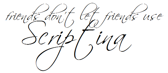
Nevertheless, the Scriptina commenting was hilarious!
and loved the sample text also!
ben – this post is so great. its very difficult for a layperson such as myself to properly put into words why a font is awful – but you are like the roger ebert of font critique! Especially love the Cougar font description – spot on!
Great write up! lol. Sample text was awesome, and painful to read!!
Every time I see Scriptina used on a web design, my eyes cross. It is so overused. And I say this as someone who did use that font when I first started blogging and before I learned how to design.
Ever notice that after you become a designer, you can pick out the fonts used on practically anything? It drives my husband nuts. LMAO
I certainly can, Shan. It’s called “fontspotting”. The activity is not quite as nerdy as “trainspotting” and is far more entertaining (it has been known to keep graphic designers occupied for hours and has also been the subject of many a fight-to-the-death between deadly factions of the “swiss school” and dangerous elements of the “helvetica brotherhood”)
Wow, you did a good job on your blog post.
Thank you Joann. Please feel free to comment on our other posts that interests you as well.
Haha, I love the Ransom Note font!