Signs and Banners 101: Everything You Need to Know
Written By: Leslie Taylor | Article Date: August 18, 2022
Is Print Advertising Dead?
With the sheer number of online ads we skip, swipe on, scroll through, and even drive by daily, it’s not surprising that there are people who assume that print advertisements are getting phased out. But several studies say otherwise.
For instance, a 2021 consumer survey revealed that 42% of respondents find print media trustworthy while only 29% trust search engine results. Another found that people who met a brand through print are 70% more likely to remember it. Meanwhile, a 2020 study discovered that exposing consumers to a print ad make them 20% more likely to visit the brand’s website and increase their purchase intent by 22%.
Instead of favoring one over the other, business owners and marketers should incorporate both traditional and digital marketing tactics into their promotional strategies. Read on for a comprehensive guide on signs and banners.
Know Your Signage: Definition of Terms
Signs and banners are two of the most common print marketing materials. What’s the difference between the two?
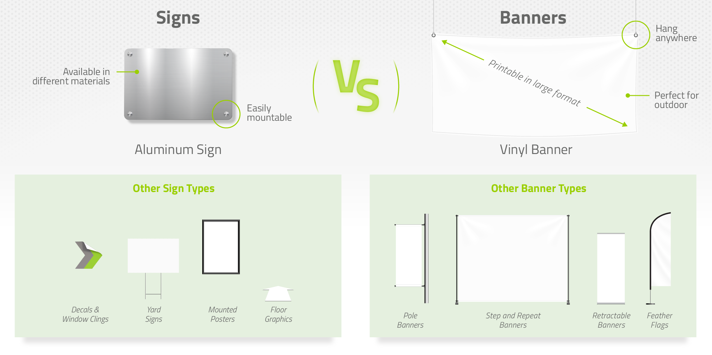
A sign or signage is any surface or structure with characters, letters, or illustrations used to express a message. Signs have been used to advertise products and services as early as 800 BC, when ancient Egyptians and Greeks promoted their trades by carving symbols on stone, brick, wood, and even marble. Nowadays, the most common materials for making signs are vinyl, paper, and aluminum. Signs can also be displayed in different ways – staked on the ground, hung on a pole, mounted on a wall, and stuck on a window, among others.
A banner, on the other hand, is just one of the many forms of signage. A single banner can grab the attention of several people all at once because of its size. Although there are posters that come in large sizes, banners are made of more durable materials that are suitable for outdoor advertising.
Choosing the Right Type
It can be quite overwhelming to decide which style suits your exact needs and requirements since signs and banners come in different shapes and sizes. To help you narrow down your choices, you only need to answer these three questions:
- What is the sign or banner for?
- Will you display it indoors or outdoors?
- How much are you willing to spend?
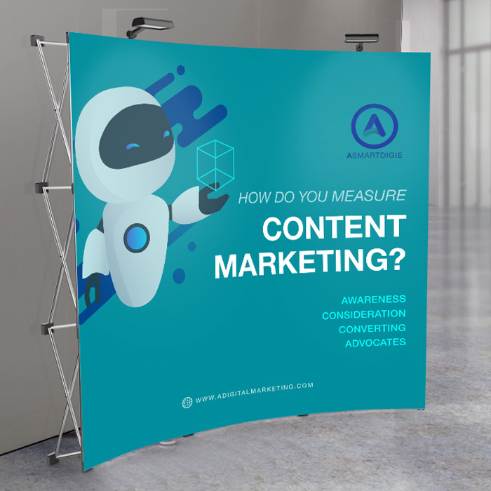
Purpose. Before you start listing the pros and cons between a retractable banner and teardrop flag, you must identify what the signage will be used for. If your business or organization often participates in conferences and tradeshows, a lightweight signage that can be folded or rolled up is easier to transport and store.

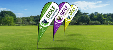
For events or activities held outdoors, signage made from fabric such as teardrop flags or feather flags will make you stand out in open areas.

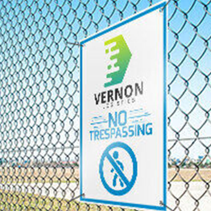
For intimate celebrations like birthdays and graduation parties, a yard sign will usually suffice. However, if you are planning to put a photo of the celebrant on your sign, consider a vinyl banner instead. You get more space since the size is customizable and the graphics will show up better since the material is opaque.

If the signage will be used to give directions or identify locations, visibility and durability are the top priorities. An aluminum sign is your best bet – the material is commonly used in wayfinding signs such as route markers and site maps since it stays visible and lasts long regardless of the lighting and weather conditions.
If the signage will double as decoration, consider decals or clings to dress up your interiors. These are also suitable for seasonal or short-term promotions since they are easy to install and remove. Large posters and canvas prints are also great options for displaying blown-up artworks or high-quality photos.

Location. Signage is made from a wide range of materials. There are some that require care and others that can withstand rough conditions. Take vinyl for instance. This material is widely used for outdoor advertising, but did you know that it comes in different types? 13 oz. vinyl is the most common choice, but if you need something more durable, the puncture-resistant 18 oz. vinyl is an excellent alternative. If you are advertising in a windy location, mesh vinyl is the right choice. It has small holes that allow air to pass through to prevent tearing.
Cost. The budget is the ultimate deciding factor for most people when it comes to buying signage. If you are getting a sign or banner for your business, think of it as an investment. After all, this is what will initially attract people to check out your products or services. The signage must enhance the customer’s experience with your brand regardless of the style you choose and the quantity you print.
According to research, 85% of your customers are located within a five-mile radius of your business. Yard signs and vinyl banners are a good starting point for promoting an upcoming sale or a new store opening since they are the most cost-effective and versatile options. But if you want to try out something different, mounted posters are just as effective.
For real estate professionals, an aluminum sign mounted on an iron frame or a real estate post will give your advertisement a more premium feel.
For events, you might want to consider adding a step and repeat banner or a backdrop. Not only will this elevate your event’s overall look, having your guests’ photos taken in front of them exposes your brand to more people once the pictures are posted online.
3 Design Tips for Large Signs and Banners
Although size plays a significant role in making your sign or banner noticeable, it’s not the only factor that can make or break your signage’s effectiveness. Here are tried-and-tested design tips for large format printing that’ll help you get results:

1. Know the basics of visual hierarchy.
Visual hierarchy makes the signage easier to process and understand. To emphasize essential information and make the design flow flawlessly, designers manipulate different elements such as:- Size – The eyes are naturally drawn to larger figures. Create a focal point by increasing the size of the text or image that you want people to look at first.

- Color – There are several resources on how color can affect one’s mood and behavior. When it comes to combining different hues, keep in mind that bright and contrasting colors stand out, while monochromatic hues evoke a softer and more balanced feel.

- Contrast – Adding contrast to your design attracts the reader’s attention and encourages them to engage their imagination. This design element is not just applicable to colors – try it out with different lines and shapes.

- Typography – The most important details should be in bold headings to immediately capture the reader’s attention. Keep in mind that sans-serif typefaces like Helvetica are easier to read compared to serif fonts such as Times New Roman.

- Alignment – Proper alignment makes a sign easy to scan and read. Any element that’s out of place instantly sticks out and ruins the overall flow of your design.

- White Space – also referred to as negative space. Leaving parts of your design empty or unoccupied allows readers to spot the essential information and gives their eyes room to rest.

2. Consider the material.
Today’s printers can print on any material imaginable without sacrificing quality. However, how they look outdoors or at night won’t be the same as the moment they got off the press. For instance, corrugated plastic is a translucent material, which means your sign must be in bold, contrasting colors to remain visible in broad daylight. The same goes for mesh vinyl.Most banner printing shops use UV ink for outdoor signs since it’s more durable and more opaque compared to regular ink. Don’t hesitate to ask your sign printing shop if they have it.
3. Choose the right settings.
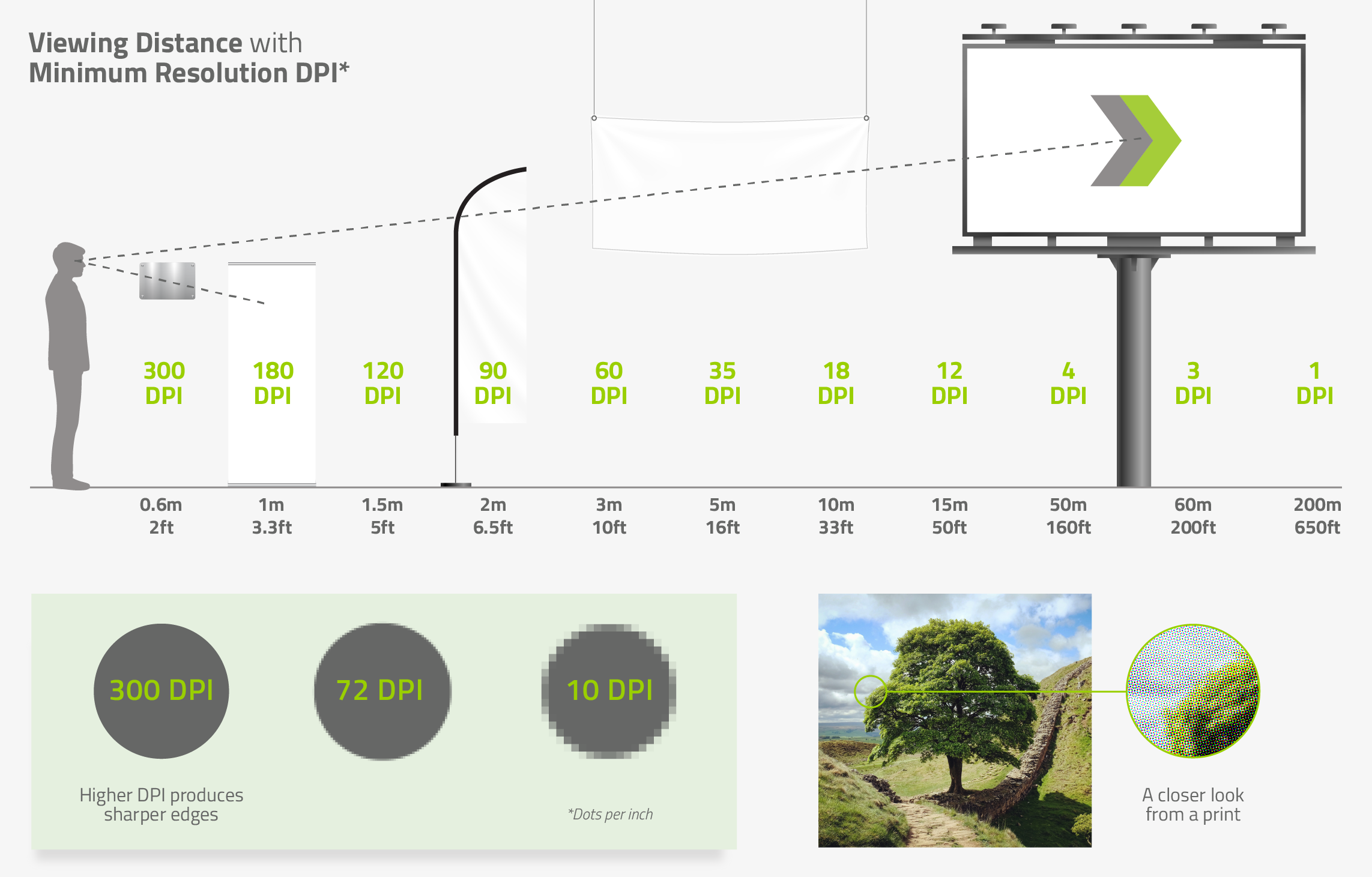
Go big without issues by double checking the following settings before you send off your design to a large-format printer.Resolution. The DPI (dots per inch) is dictated by the sign’s viewing distance. So a smaller DPI doesn’t necessarily equate to lower quality, it just means that your design is best viewed from afar. Refer to the chart below:
Color Mode. There are two color modes in graphic design: RGB, which stands for red, green, and blue, and CMYK, which is short for cyan, magenta, yellow, and key. RGB is best used for designs meant for digital or electronic screens, while CMYK is the preferred choice for print products such as signs and banners.
Bleed and Trim Lines. Cropping is not just a design software feature, it’s also an accident waiting to happen during production. By adding bleed lines, the banner printing shop will be able to identify which parts of the design is safe to cut or stitch over. Found within the bleed lines are the trim lines. these show the final size of your sign or banner.
5 Websites for Designing Signs and Banners
Thanks to browser-based design platforms, even people without a design background can create professional-looking custom signs and banners. Some of these websites also offer templates for large-format print products such as billboards, signs, and banners.
NextDayFlyers
NextDayFlyers offers free design templates that are downloadable as vector graphics. This file format is preferred by many designers since it's easy to resize and requires less disk space. Aside from free templates, the online printing shop also has an intuitive online design tool so customers can create designs from scratch upon placing their order.
Envato Elements
Envato Elements boats over 10 million creative assets that anyone can access for $16.50 per month. This includes fonts, music, sound effects, website templates, and more than 200,000 graphic templates for print products such as invitations, posters, and retractable banners.
Canva
Canva has over 17,000 free banner templates that are highly customizable and easy to print. The designs range from store openings, back to school greetings, events, and holidays.
Colorcinch
Colorcinch is another online photo editing platform with an extensive range of features. Basic account holders get free access to editing tools, effects, filters, and the platform’s stock image library. Users can also draw their designs using different brushe
Visme
Visme is a cloud-based platform where users to design, store, and share content. Aside from its library of stunning templates for different projects such as eBooks, infographics, presentation decks, and posters, it also has educational resources for non-designers who want to learn more about visual communication.
Resources on Signs and Banners
Do PR and Communications executives think print advertising is still relevant today? Find out what the experts from Forbes Communications Council have to say about the future of print.
Are you still racking your brains for design ideas? Beat the creative block with these 50 brilliant examples.
Which advertising channels do consumers find most and least trustworthy? This study asked over 1,200 individuals in the US.
Numbers don’t lie. Let these marketing statistics convince you that print marketing is worth the shot.
Are your font sizes big enough for your signage? Learn about proper letter sizing in this guide.
This book breaks down the different traditional and digital printing methods.
Conclusion
As you can see, print advertising is very much alive and kicking. There’s one for every need, activity, style, and even budget. This is the sign (no pun intended) you’ve been looking for – use signs and banners to spread your message.
